
Jubilee Air is a conceptual airline brand designed to deliver a premium yet family-friendly travel experience, tailored specifically for guests traveling to major theme park destinations across the United States. The project centered on creating a cohesive brand identity system that includes a logo, color palette, visual patterns, and comprehensive style guidelines, all working together to communicate a sense of excitement, safety, and reliability in air travel.
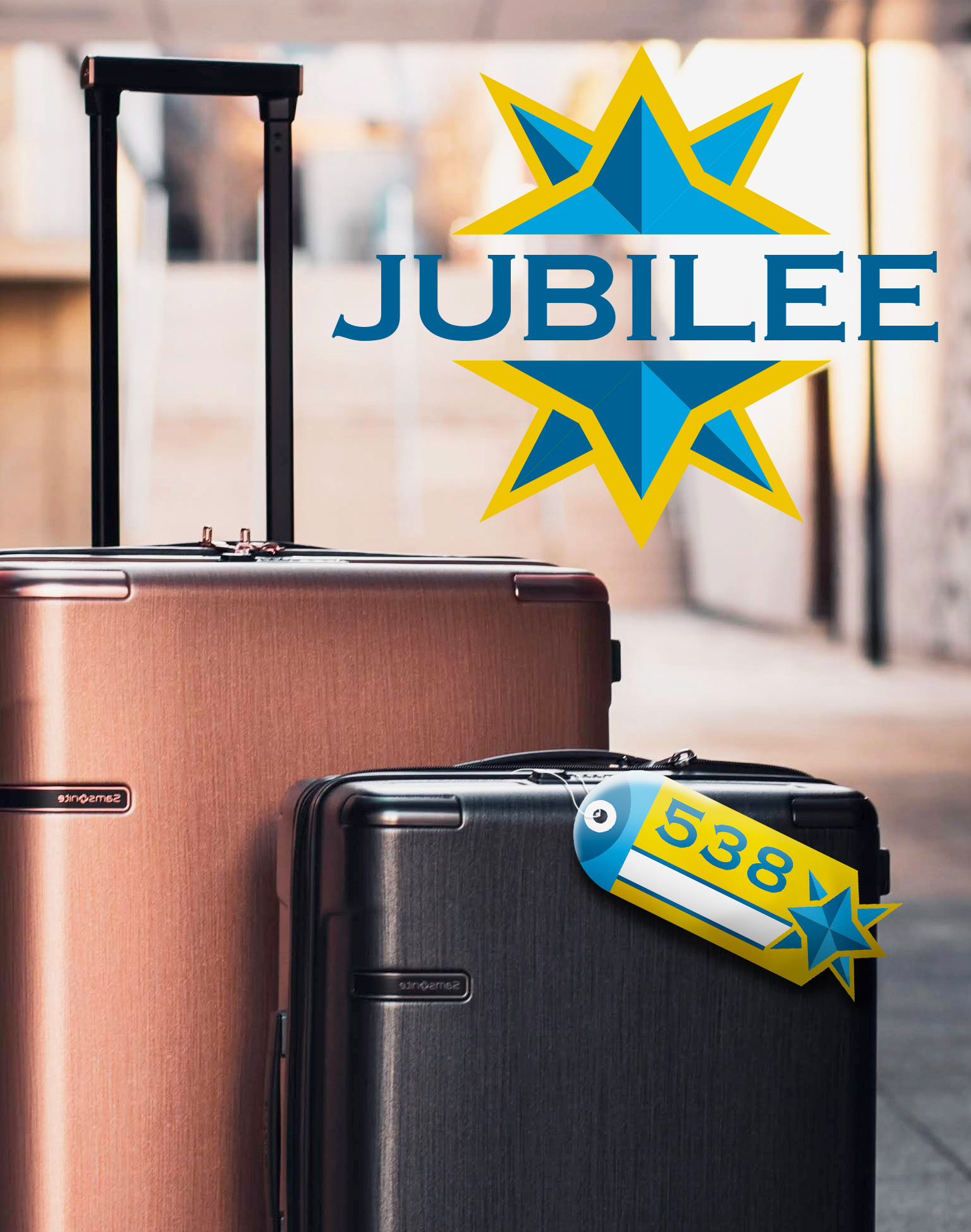
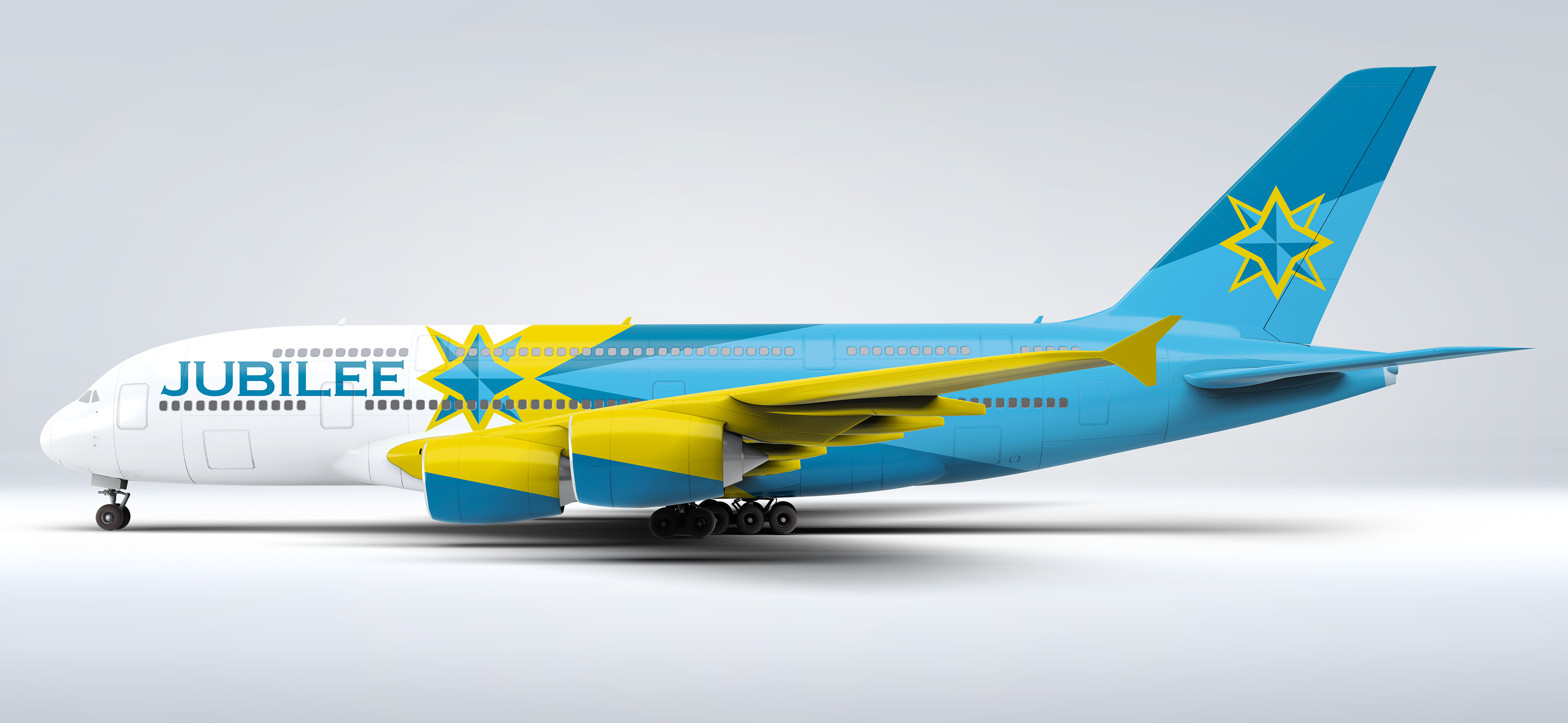
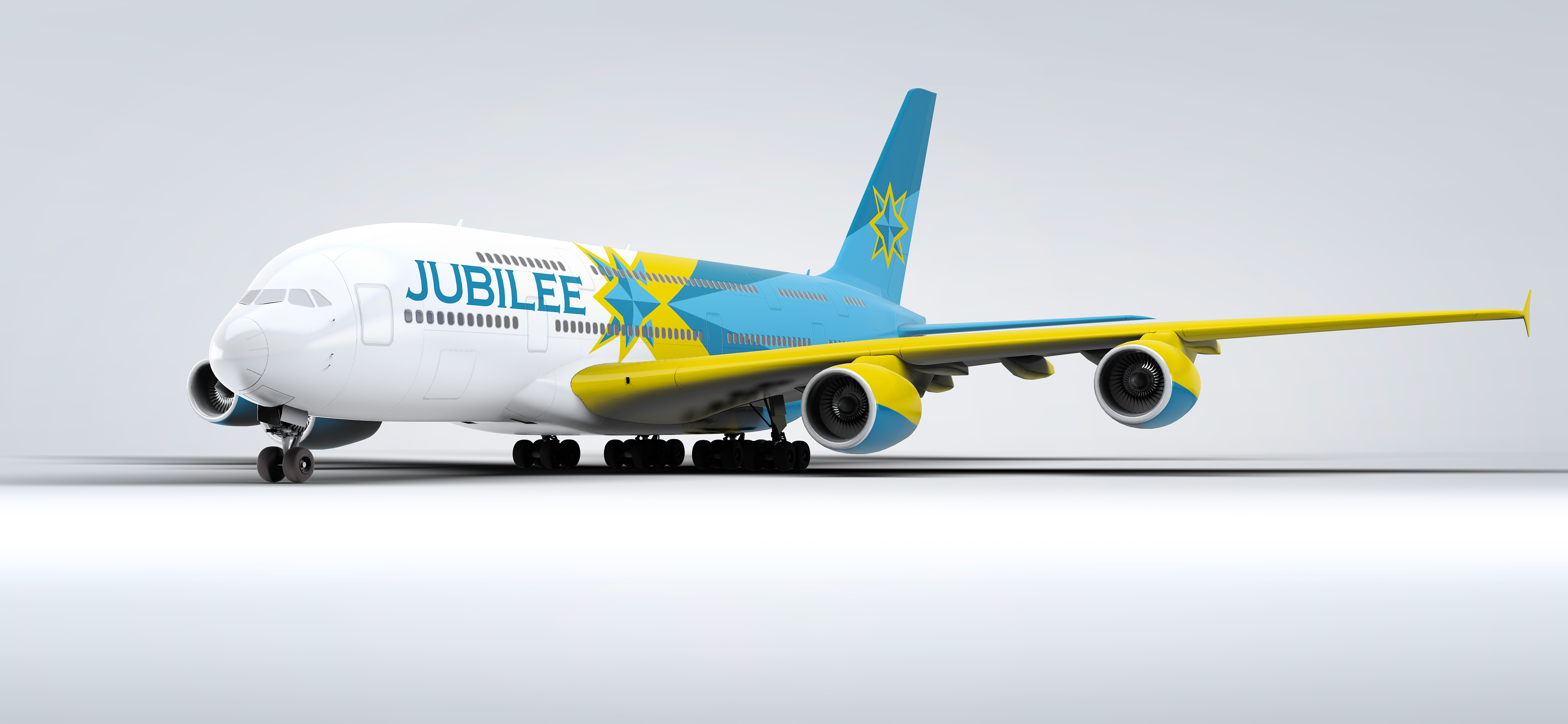
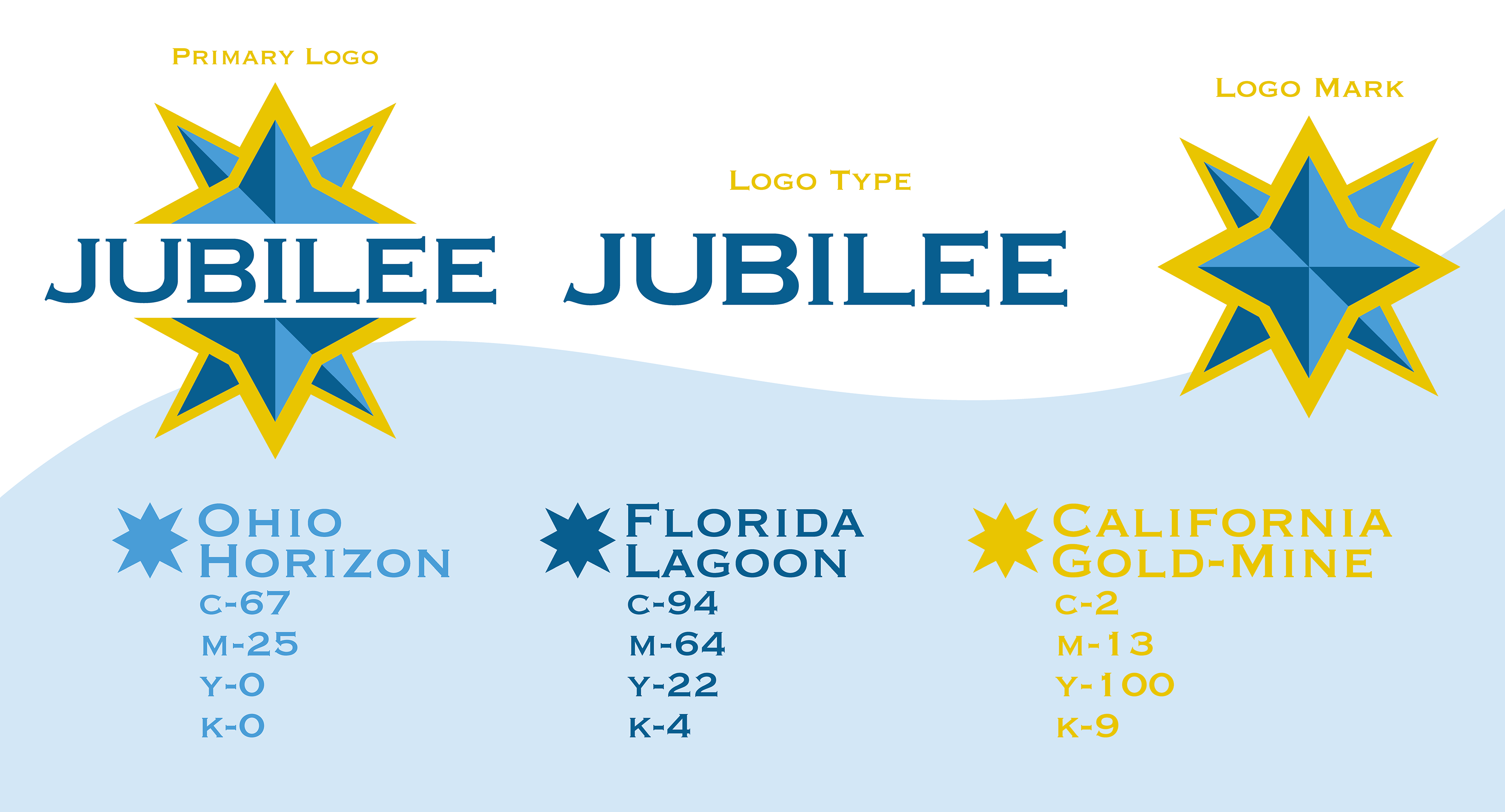
At the core of the brand is the “Jubilee Star,” a graphic mark that represents both imagination and patriotism. Designed to function dynamically across applications, the star appears as a shooting star when placed on aircraft tails, symbolizing motion, aspiration, and journey. Supporting the mark is a clean, sans-serif typographic system that reinforces clarity, strength, and modernity, while remaining approachable for a broad family-oriented audience. The color palette combines regal tones with bright, energetic accents to represent three popular destination locations for America's favorite theme parks.
Jet Design
Brand Guidelines
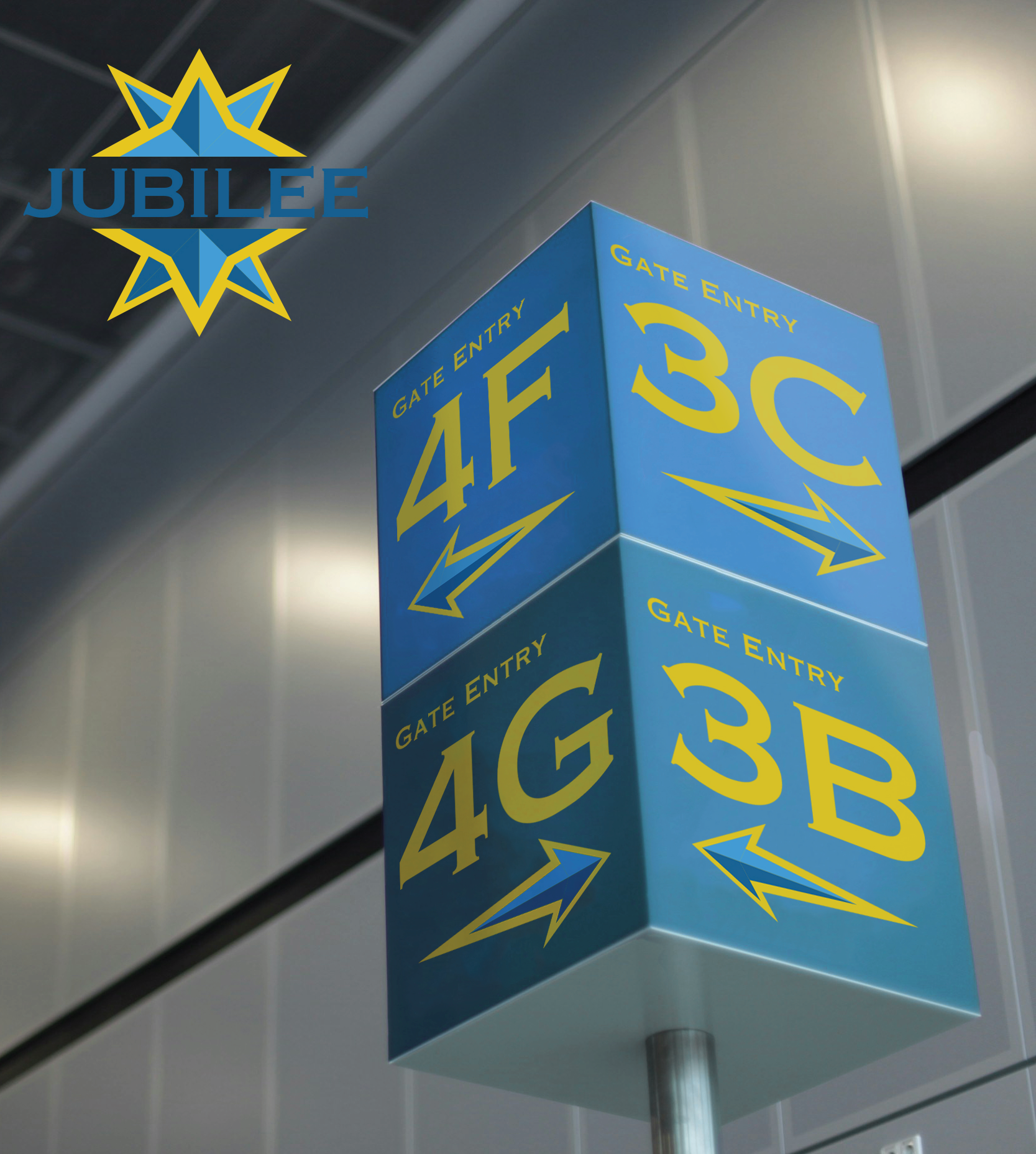
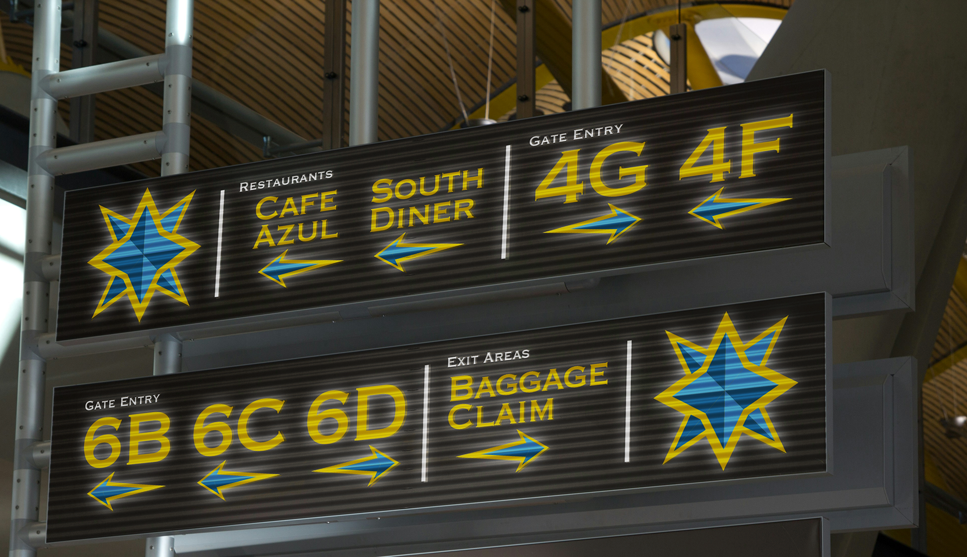
The branding extends into environmental and spatial design through airport terminal signage, where wayfinding systems were developed to enhance clarity and ease of navigation. These systems prioritize legibility, hierarchy, and intuitive visual cues, ensuring that first-time flyers and families alike can move comfortably through the space. At the same time, the signage maintains a welcoming tone that aligns with the brand’s friendly and uplifting personality.
Finally, the identity was applied to aircraft livery and exterior design, translating the brand into a moving visual experience. The resulting plane design integrates the star motif, color scheme, and patterns into a unified composition that stands out in both motion and at rest. Together, these elements form a complete and scalable airline identity that communicates trust, excitement, and a sense of adventure from the terminal to the skies.
Collateral Gallery